Welcome back! Now that you have decided on what to frame , and how you are going to draw attention to it , you are now ready to produce your own creative art.
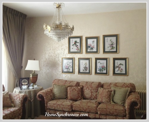
During my visit to Jordan last summer, I had a chance to be creative with an old collection of wall art in my parents’ home. I replaced the old frames with new ones, added matting to highlight the art, and grouped them into a wall gallery.
An element of design that played a key role in the success of the composition above is visual balance. Balance as we all know it, is when two items of similar weight are placed on a scale and they balance each other out.
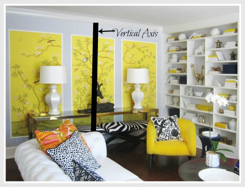
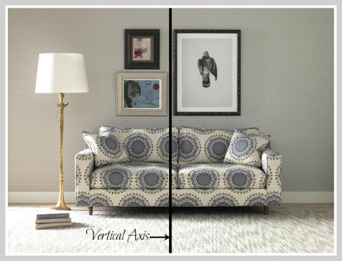
In interior design, visual balance occurs around a vertical axis that represents the scale. The visual weight of objects on either side of that axis must be equal for it to look balanced. When you feel that something is “off” in your design, that is most likely due to an imbalance.
There are two types of balance, Symmetrical and Asymmetrical.
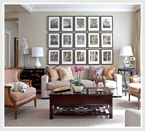
Symmetrical balance is when one side is the mirror image of the other. The elements on either side of the axis have similar look and weight . This is easy to achieve and reflects formality.
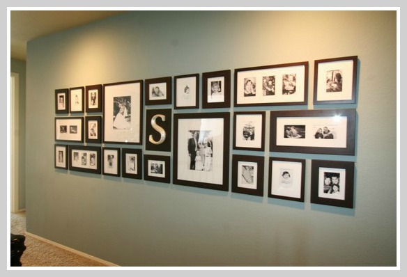
Asymmetrical balance is when both sides look different from each other. The elements on either side of the axis have similar visual weight but look different . This needs practice to achieve but it gives a fun and casual feel to any space.
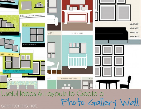
So now that you understand visual balance , you can start experimenting with different layouts for your wall gallery. Lay your arrangements on the floor, take a picture of each one, then compare those pictures to find the best layout.
Jenna from Sasinteriors gathered many examples for gallery wall layouts in one post. This would be a great reference for anyone who is interested in turning a wall into a stunning focal point in their home.
One more thing to consider when you experiment with different layouts is the effect they generate. A Vertical layout gives the feeling of formality and adds visual height to a room.
While horizontal layouts are more casual and widen the space.
Finally, here are some tips from Home Decorating Made Easy to keep in mind when deciding on a layout for your wall gallery
▪ In design, an odd number of grouped items is more visually appealing than an even number.
▪ Larger pieces are visually heavier than smaller pieces.
▪ Dark colored pieces are visually heavier than light colored ones.
▪ Arrange groupings into a shape such as a triangle, square, or circle for visual flow.
▪ For added elegance, consider highlighting your grouping with a light.
With that I end this mini series on creative art. I hope you are now confident to decorate your home with your own framed art. When you do , please send me a picture. 🙂
Have a great weekend!


Leave a Reply