Last week, I shared some creative ideas for things to frame in part 1 of creative art. Today, I will be showing you how to highlight your framed art, especially in a wall gallery.
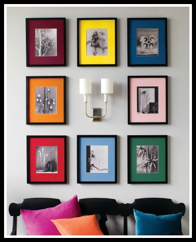
Let’s start by examining the picture below, what is the first thing that captures your attention?
The colored photo mats? Exactly! Because that is what the designer wants you to see.
There is nothing else in this composition that is competing with the color for attention, so the color pops out. In other words, the frames are similar in size and color, the photos are in black and white, so the mat color pops out.
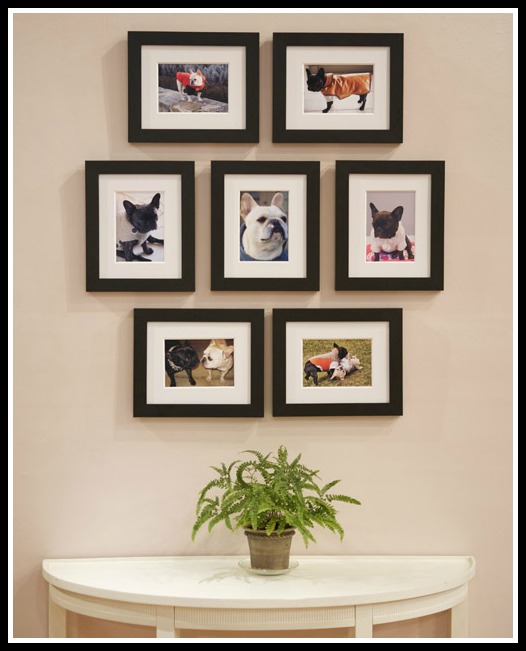
When you look at the grouping below, you will see that the photos are highlighted. Why?
The frames are black, the mats are white, so the photos pop out. Simple, isn’t it!
It is important to unify your grouping either by unifying the theme (dogs), the color of the frame (Black), the shape of the frame (rectangle), the color of the mat (white), or the thickness of the frame. So, as you can see from the two examples above, when you unify everything, the one thing that you vary will pop out.
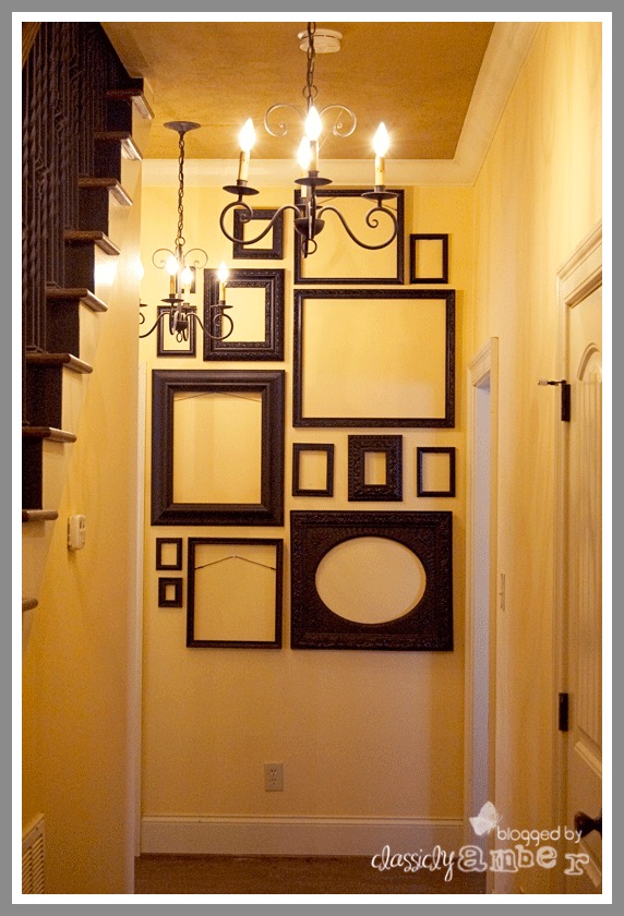
In creative art-part 1, I shared this photo from classicly Amber.
Why is this arrangement pleasing? Which element is unified? Which element is varied? (scroll below for the answer) 🙂
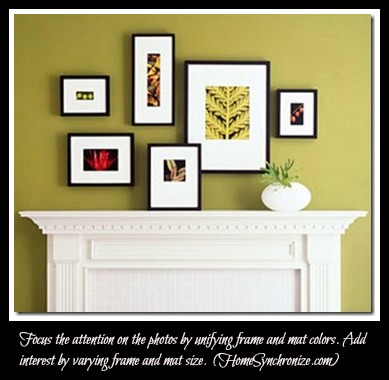
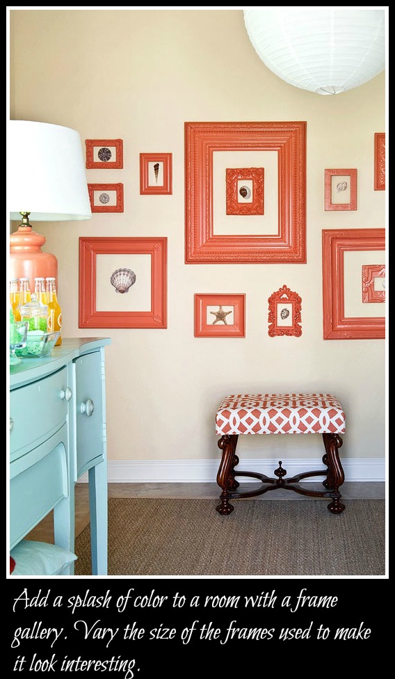
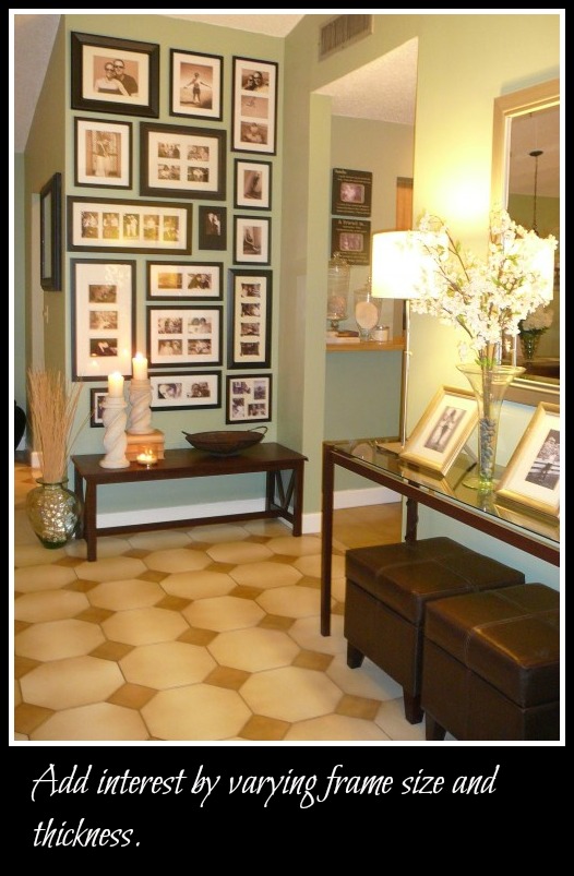
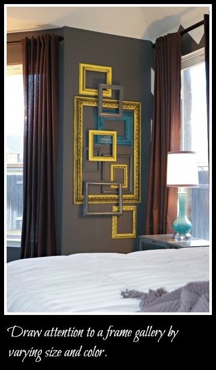
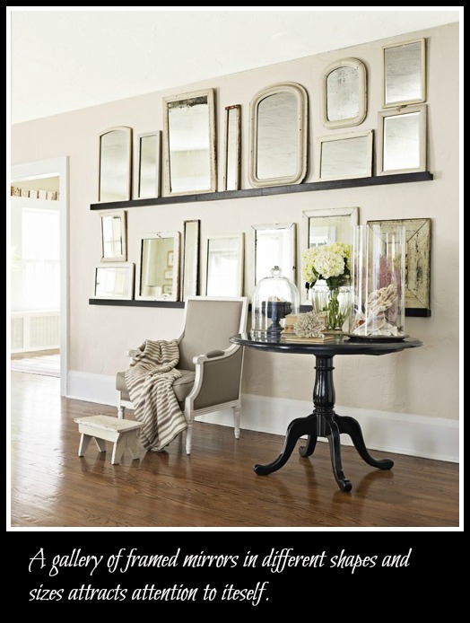
Here are more examples of interesting frame groupings …
The way I see it is this : When it comes to framed wall galleries, whatever you seek to focus attention on should look different from its surrounding!
Have you created a framed wall gallery in your home? I would love to see it. Please share a picture on my facebook page.
Next week, I will share tips on creating successful wall galleries.
Stay close! 🙂
Answer to empty frame wall gallery: The frames are unified in color and theme (in that they are all empty). They vary in thickness and shape. This creates a sense of movement which makes it visually appealing.

Leave a Reply