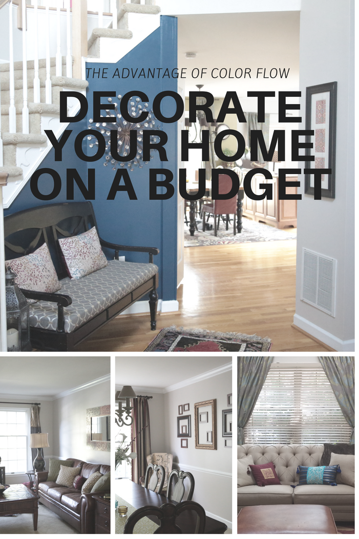
Have you ever walked into a home and felt at peace just being there? Chances are the colors in the home had something to do with it (read more about color psychology here). A balanced color scheme that connects each room in the house creates a harmonious feeling that flows throughout the house. This is known as color flow.
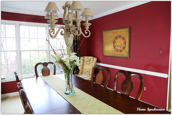
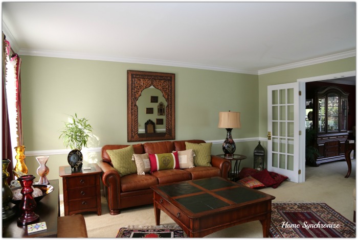
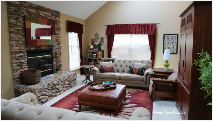
When we moved into our house six years ago, the original colors on the wall were red, yellow, and green. They fit perfectly with our furniture and accessories and were warm and inviting.
The dining room was painted a bold red color.
The living room was painted a pastel green color
The rest of the house was painted a cumin yellow color.
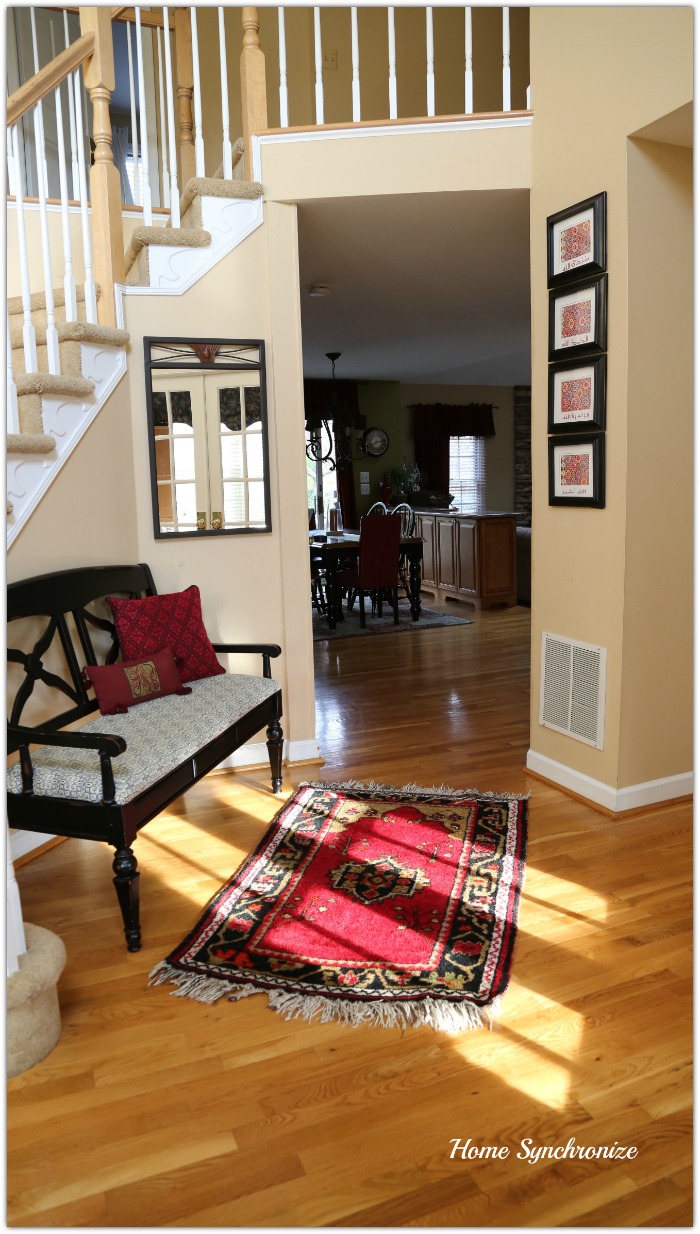
I loved the colors in our home but after living with them for six years, the red and yellow were getting to be too warm and we were finding ourselves feeling lazy and sleepy (this is our excuse and we are sticking to it 😉). It was time for a fresh look. A “cool” look. This summer, since we were not traveling back to Jordan, we finally had our home painted.
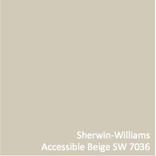
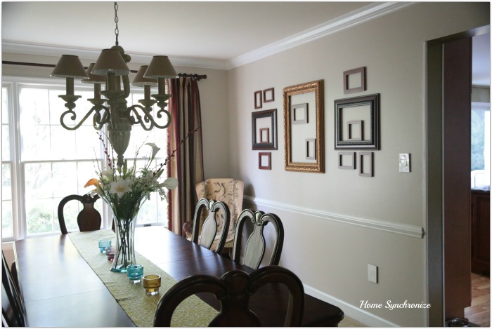
I wanted a cool and neutral background to tie my home together so that the furniture and accessories would be the stars of the show. After doing some research I chose this color from Sherwin Williams
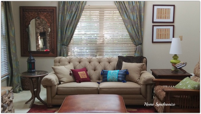
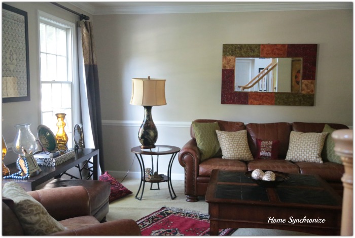
So what is the advantage of color flow? Other than the obvious harmonious feeling, color flow allows you to decorate your home on a budget. Color flow is achieved when you use the colors in your color scheme in different amounts throughout the house. Since my original color scheme did not change, I could move my furniture, wall art, accessories, and curtains around without having to buy many new things. The new neutral wall color connects all the rooms together so our home feels spacious and provides a blank canvas to try out new wall art and accessory displays. Take a look ….
I added blue to my color scheme and used it to create an accent wall in the entryway. It adds an elegant touch to the entryway and allows it to harmonize with the rest of the house (you can see how it coordinates nicely with the green in the kitchen). I sparingly incorporated the blue color throughout the house to connect the rooms together and create color flow.
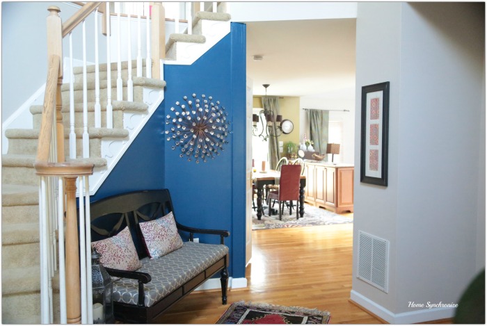
Thus far all I have purchased for my new look is an accent piece for the entryway, an area rug for the kitchen (to bring in some blue), and curtains for the family room and kitchen (blue and green jacquard fabric to infuse blue in the design). There is still work to be done to complete the look but it already feels fresh, open and most importantly, cool. 🙂

Thank you Miranda. Actually the color in the dining room is the same in the living and family room. Its just that the lighting in the dinning room makes it look different (more on the green size) but still gorgeous. As for the accent chair, I created that (and another on the opposite side of the room) with tapestry designed with Islamic calligraphy. Instead of hanging them on the wall, I just draped them over dinning room chairs to create an interesting look. 🙂
The colors blends are terrific. I especially like the color you chose for the dining room and the accent chair in the corner with the arabic calligraphy on it is very eye catching.
P.S. I love your new logo, it is very beautiful.